 ## Filament Tour
An interactive guided tour for the Filament admin panel powered by Shepherd.js.
This plugin adds a tour trigger button to the Filament user menu and lets you build a step‑by‑step walkthrough of your panel pages, with full control over colors, texts, and welcome/finish screens.
## 🎥 Filament Tour – Video Demo
[](https://www.youtube.com/watch?v=T3nCOYcl3Do)
> Click the image to watch the full video on YouTube.
---
## Requirements
- PHP ^8.2
- Filament ^3.0 or ^4.0
---
## Installation
Require the package via Composer:
```bash
composer require yacoubalhaidari/filament-tour
```
Optionally publish the CSS/JS assets into your `public` directory (for example if you want to serve them statically or customize them):
```bash
php artisan filament-tour:assets
```
This will publish:
- `public/css/yacoubalhaidari/filament-tour/filament-tour-styles.css`
- `public/js/yacoubalhaidari/filament-tour/filament-tour-scripts.js`
> The service provider also auto‑registers the package assets from the package itself, so publishing is optional.
---
## Registering the Plugin
In your Filament `PanelProvider`, register the plugin and optionally customize the tour button and appearance.
```php
use Filament\Panel;
use YacoubAlhaidari\FilamentTour\FilamentTourPlugin;
class AdminPanelProvider extends PanelProvider
{
public function panel(Panel $panel): Panel
{
return $panel
->plugins([
FilamentTourPlugin::make()
// Show / hide the trigger button in the user menu
->showTourButton(true)
// Trigger button appearance
->tourButtonIcon('heroicon-o-academic-cap')
->tourButtonColor('info')
->tourButtonTooltip(trans('filament-tour.tooltip'))
// Color customization (all are optional)
->headerColor('linear-gradient(135deg, #282835 0%, #282835 100%)')
->primaryButtonColor('linear-gradient(135deg, #282835 0%, #282835 100%)')
->secondaryButtonColor('linear-gradient(135deg, #282835 0%, #282835 100%)')
->textColor('#1f2937')
->backgroundColor('linear-gradient(135deg, #282835 0%, #282835 100%)')
->contentBackgroundColor('#282835')
->footerBackgroundColor('linear-gradient(180deg, #282835 0%, #282835 100%)')
->primaryButtonHoverColor('linear-gradient(135deg, #ea580c 0%, #dc2626 100%)')
->secondaryButtonHoverColor('linear-gradient(135deg, #282835 0%, #282835 100%)')
->primaryButtonTextColor('#ffffff')
->secondaryButtonTextColor('#ffffff')
->footerBorderColor('rgba(0, 0, 0, 0.1)')
// Optional custom welcome & finish steps
->welcomeStep([
'id' => 'welcome',
'title' => 'مرحباً مخصص!',
'text' => 'رسالة ترحيب مخصصة',
'buttons' => [
['text' => 'تخطي', 'action' => 'cancel', 'secondary' => true],
['text' => 'ابدأ', 'action' => 'next', 'secondary' => false],
],
])
->finishStep([
'id' => 'finish',
'title' => 'تهانينا مخصص!',
'text' => 'رسالة إنهاء مخصصة',
'buttons' => [
['text' => 'السابق', 'action' => 'back', 'secondary' => true],
['text' => 'إنهاء', 'action' => 'complete', 'secondary' => false],
],
]),
]);
}
}
```
### Plugin Methods
All configuration methods are chainable on `FilamentTourPlugin::make()`:
- `showTourButton(bool $condition = true)` – Show or hide the tour trigger icon in the user menu.
- `tourButtonIcon(string $icon)` – Heroicon or custom icon class for the trigger button.
- `tourButtonColor(string $color)` – Filament color name (e.g. `info`, `primary`, `success`).
- `tourButtonTooltip(string $tooltip)` – Tooltip text shown when hovering the trigger button.
Color customization (all optional – values are used directly as CSS values and wired into CSS variables):
- `headerColor(string $color)` – Header background (e.g. gradient or hex color).
- `primaryButtonColor(string $color)` – Primary button background.
- `secondaryButtonColor(string $color)` – Secondary button background.
- `textColor(string $color)` – Main text color inside the tour.
- `backgroundColor(string $color)` – Overall tour background.
- `contentBackgroundColor(string $color)` – Content area background.
- `footerBackgroundColor(string $color)` – Footer background (where buttons sit).
- `primaryButtonHoverColor(string $color)` – Primary button hover background.
- `secondaryButtonHoverColor(string $color)` – Secondary button hover background.
- `primaryButtonTextColor(string $color)` – Text color inside the primary button.
- `secondaryButtonTextColor(string $color)` – Text color inside the secondary button.
- `footerBorderColor(string $color)` – Border color above the footer.
Custom welcome / finish steps:
- `welcomeStep(array $step)` – Override the default first step.
- `finishStep(array $step)` – Override the default last step.
Each step array supports at least:
```php
[
'id' => 'welcome', // Unique step ID
'title' => 'عنوان الخطوة', // Step title
'text' => 'HTML', // Step body (HTML allowed)
'buttons' => [
['text' => 'تخطي', 'action' => 'cancel', 'secondary' => true],
['text' => 'التالي', 'action' => 'next', 'secondary' => false],
['text' => 'السابق', 'action' => 'back', 'secondary' => true],
['text' => 'إنهاء', 'action' => 'complete','secondary' => false],
],
]
```
Supported button actions: `back`, `next`, `cancel`, `complete`.
---
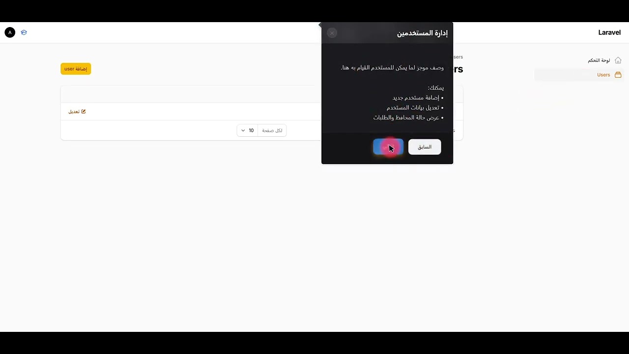
## Defining Dynamic Tour Steps on Resources
Dynamic steps are collected automatically from your Filament resources that use the `HasTourSteps` concern.
Add the trait to any resource you want to appear in the tour:
```php
use Filament\Resources\Resource;
use YacoubAlhaidari\FilamentTour\Concerns\HasTourSteps;
class MerchantResource extends Resource
{
use HasTourSteps;
public static function getTourStepId(): ?string
{
return 'merchants-list';
}
public static function getTourStepTitle(): ?string
{
return 'إدارة التجار';
}
public static function getTourStepDescription(): ?string
{
return 'وصف موجز لما يمكن للمستخدم القيام به هنا.';
}
public static function getTourStepFeatures(): array
{
return [
'إضافة تاجر جديد',
'تعديل بيانات التاجر',
'عرض حالة المحافظ والطلبات',
];
}
public static function getTourStepPosition(): string
{
// Shepherd position: top|bottom|left|right|center ...
return 'right';
}
public static function getTourStepSort(): int
{
// Lower numbers appear earlier in the tour
return 10;
}
}
```
### What the Trait Provides
`HasTourSteps` defines the following static methods (with sensible defaults):
- `getTourSteps(): array` – Low-level hook if you want to return fully custom step definitions (defaults to `[]`).
- `getTourStepId(): ?string` – Unique ID for the step (also used as `data-tour` value).
- `getTourStepTitle(): ?string` – Step title (defaults to `static::getModelLabel()`).
- `getTourStepDescription(): ?string` – Short description paragraph.
- `getTourStepFeatures(): array` – Bullet list of features; rendered as a list in the tooltip.
- `getTourStepPosition(): string` – Tooltip position relative to the target (default `right`).
- `getTourStepSort(): int` – Sort order (lower = earlier in the tour; default `100`).
- `getTourSelector(): ?string` – Selector used to attach the step (defaults to `getTourStepId()`).
- `hasTourStep(): bool` – Whether the resource should participate in the tour.
The package collects these steps via `TourStepCollector` and passes them to the frontend as `window.dynamicTourSteps`.
---
## How Navigation Matching Works
On the frontend, the script automatically tries to match your resources to sidebar navigation items and adds `data-tour="{id}"` attributes.
- The navigation label from each resource is mapped to a step ID via an internal navigation map.
- When a tour step is shown, the corresponding sidebar item is highlighted.
- Some Arabic labels have built‑in fallbacks (e.g. التجار, الميزانيات, الإعدادات ...) for convenience.
If you keep your `getTourStepId()` values meaningful (e.g. `merchants-list`, `budgets`, `financial-settings`) you’ll get good matching out of the box.
---
## Localization (en / ar)
The package ships with simple translation files that you can override in your app:
- `resources/lang/en/filament-tour.php`
- `resources/lang/ar/filament-tour.php`
Each file contains default labels for the welcome/finish steps and button texts. You can override them in your own application like any other Laravel lang file and then map them into your custom `welcomeStep()` / `finishStep()` calls, for example:
```php
FilamentTourPlugin::make()
->welcomeStep([
'id' => trans('filament-tour.welcome.id'),
'title' => trans('filament-tour.welcome.title'),
'text' => trans('filament-tour.welcome.text'),
'buttons' => [
['text' => trans('filament-tour.welcome.buttons.skip'), 'action' => 'cancel', 'secondary' => true],
['text' => trans('filament-tour.welcome.buttons.start'), 'action' => 'next', 'secondary' => false],
],
])
->finishStep([
'id' => trans('filament-tour.finish.id'),
'title' => trans('filament-tour.finish.title'),
'text' => trans('filament-tour.finish.text'),
'buttons' => [
['text' => trans('filament-tour.finish.buttons.back'), 'action' => 'back', 'secondary' => true],
['text' => trans('filament-tour.finish.buttons.finish'), 'action' => 'complete', 'secondary' => false],
],
]);
```
---
## Running the Tour
- Click the tour icon in the Filament user menu (default `heroicon-o-academic-cap`).
- The tour starts at the welcome step (default or your custom `welcomeStep`).
- Dynamic resource steps run in order of `getTourStepSort()`.
- The final step is the finish screen (default or your custom `finishStep`).
The tour remembers progress in `localStorage` and can automatically resume after navigation.
---
## License
Released under the MIT License.
## Filament Tour
An interactive guided tour for the Filament admin panel powered by Shepherd.js.
This plugin adds a tour trigger button to the Filament user menu and lets you build a step‑by‑step walkthrough of your panel pages, with full control over colors, texts, and welcome/finish screens.
## 🎥 Filament Tour – Video Demo
[](https://www.youtube.com/watch?v=T3nCOYcl3Do)
> Click the image to watch the full video on YouTube.
---
## Requirements
- PHP ^8.2
- Filament ^3.0 or ^4.0
---
## Installation
Require the package via Composer:
```bash
composer require yacoubalhaidari/filament-tour
```
Optionally publish the CSS/JS assets into your `public` directory (for example if you want to serve them statically or customize them):
```bash
php artisan filament-tour:assets
```
This will publish:
- `public/css/yacoubalhaidari/filament-tour/filament-tour-styles.css`
- `public/js/yacoubalhaidari/filament-tour/filament-tour-scripts.js`
> The service provider also auto‑registers the package assets from the package itself, so publishing is optional.
---
## Registering the Plugin
In your Filament `PanelProvider`, register the plugin and optionally customize the tour button and appearance.
```php
use Filament\Panel;
use YacoubAlhaidari\FilamentTour\FilamentTourPlugin;
class AdminPanelProvider extends PanelProvider
{
public function panel(Panel $panel): Panel
{
return $panel
->plugins([
FilamentTourPlugin::make()
// Show / hide the trigger button in the user menu
->showTourButton(true)
// Trigger button appearance
->tourButtonIcon('heroicon-o-academic-cap')
->tourButtonColor('info')
->tourButtonTooltip(trans('filament-tour.tooltip'))
// Color customization (all are optional)
->headerColor('linear-gradient(135deg, #282835 0%, #282835 100%)')
->primaryButtonColor('linear-gradient(135deg, #282835 0%, #282835 100%)')
->secondaryButtonColor('linear-gradient(135deg, #282835 0%, #282835 100%)')
->textColor('#1f2937')
->backgroundColor('linear-gradient(135deg, #282835 0%, #282835 100%)')
->contentBackgroundColor('#282835')
->footerBackgroundColor('linear-gradient(180deg, #282835 0%, #282835 100%)')
->primaryButtonHoverColor('linear-gradient(135deg, #ea580c 0%, #dc2626 100%)')
->secondaryButtonHoverColor('linear-gradient(135deg, #282835 0%, #282835 100%)')
->primaryButtonTextColor('#ffffff')
->secondaryButtonTextColor('#ffffff')
->footerBorderColor('rgba(0, 0, 0, 0.1)')
// Optional custom welcome & finish steps
->welcomeStep([
'id' => 'welcome',
'title' => 'مرحباً مخصص!',
'text' => 'رسالة ترحيب مخصصة',
'buttons' => [
['text' => 'تخطي', 'action' => 'cancel', 'secondary' => true],
['text' => 'ابدأ', 'action' => 'next', 'secondary' => false],
],
])
->finishStep([
'id' => 'finish',
'title' => 'تهانينا مخصص!',
'text' => 'رسالة إنهاء مخصصة',
'buttons' => [
['text' => 'السابق', 'action' => 'back', 'secondary' => true],
['text' => 'إنهاء', 'action' => 'complete', 'secondary' => false],
],
]),
]);
}
}
```
### Plugin Methods
All configuration methods are chainable on `FilamentTourPlugin::make()`:
- `showTourButton(bool $condition = true)` – Show or hide the tour trigger icon in the user menu.
- `tourButtonIcon(string $icon)` – Heroicon or custom icon class for the trigger button.
- `tourButtonColor(string $color)` – Filament color name (e.g. `info`, `primary`, `success`).
- `tourButtonTooltip(string $tooltip)` – Tooltip text shown when hovering the trigger button.
Color customization (all optional – values are used directly as CSS values and wired into CSS variables):
- `headerColor(string $color)` – Header background (e.g. gradient or hex color).
- `primaryButtonColor(string $color)` – Primary button background.
- `secondaryButtonColor(string $color)` – Secondary button background.
- `textColor(string $color)` – Main text color inside the tour.
- `backgroundColor(string $color)` – Overall tour background.
- `contentBackgroundColor(string $color)` – Content area background.
- `footerBackgroundColor(string $color)` – Footer background (where buttons sit).
- `primaryButtonHoverColor(string $color)` – Primary button hover background.
- `secondaryButtonHoverColor(string $color)` – Secondary button hover background.
- `primaryButtonTextColor(string $color)` – Text color inside the primary button.
- `secondaryButtonTextColor(string $color)` – Text color inside the secondary button.
- `footerBorderColor(string $color)` – Border color above the footer.
Custom welcome / finish steps:
- `welcomeStep(array $step)` – Override the default first step.
- `finishStep(array $step)` – Override the default last step.
Each step array supports at least:
```php
[
'id' => 'welcome', // Unique step ID
'title' => 'عنوان الخطوة', // Step title
'text' => 'HTML', // Step body (HTML allowed)
'buttons' => [
['text' => 'تخطي', 'action' => 'cancel', 'secondary' => true],
['text' => 'التالي', 'action' => 'next', 'secondary' => false],
['text' => 'السابق', 'action' => 'back', 'secondary' => true],
['text' => 'إنهاء', 'action' => 'complete','secondary' => false],
],
]
```
Supported button actions: `back`, `next`, `cancel`, `complete`.
---
## Defining Dynamic Tour Steps on Resources
Dynamic steps are collected automatically from your Filament resources that use the `HasTourSteps` concern.
Add the trait to any resource you want to appear in the tour:
```php
use Filament\Resources\Resource;
use YacoubAlhaidari\FilamentTour\Concerns\HasTourSteps;
class MerchantResource extends Resource
{
use HasTourSteps;
public static function getTourStepId(): ?string
{
return 'merchants-list';
}
public static function getTourStepTitle(): ?string
{
return 'إدارة التجار';
}
public static function getTourStepDescription(): ?string
{
return 'وصف موجز لما يمكن للمستخدم القيام به هنا.';
}
public static function getTourStepFeatures(): array
{
return [
'إضافة تاجر جديد',
'تعديل بيانات التاجر',
'عرض حالة المحافظ والطلبات',
];
}
public static function getTourStepPosition(): string
{
// Shepherd position: top|bottom|left|right|center ...
return 'right';
}
public static function getTourStepSort(): int
{
// Lower numbers appear earlier in the tour
return 10;
}
}
```
### What the Trait Provides
`HasTourSteps` defines the following static methods (with sensible defaults):
- `getTourSteps(): array` – Low-level hook if you want to return fully custom step definitions (defaults to `[]`).
- `getTourStepId(): ?string` – Unique ID for the step (also used as `data-tour` value).
- `getTourStepTitle(): ?string` – Step title (defaults to `static::getModelLabel()`).
- `getTourStepDescription(): ?string` – Short description paragraph.
- `getTourStepFeatures(): array` – Bullet list of features; rendered as a list in the tooltip.
- `getTourStepPosition(): string` – Tooltip position relative to the target (default `right`).
- `getTourStepSort(): int` – Sort order (lower = earlier in the tour; default `100`).
- `getTourSelector(): ?string` – Selector used to attach the step (defaults to `getTourStepId()`).
- `hasTourStep(): bool` – Whether the resource should participate in the tour.
The package collects these steps via `TourStepCollector` and passes them to the frontend as `window.dynamicTourSteps`.
---
## How Navigation Matching Works
On the frontend, the script automatically tries to match your resources to sidebar navigation items and adds `data-tour="{id}"` attributes.
- The navigation label from each resource is mapped to a step ID via an internal navigation map.
- When a tour step is shown, the corresponding sidebar item is highlighted.
- Some Arabic labels have built‑in fallbacks (e.g. التجار, الميزانيات, الإعدادات ...) for convenience.
If you keep your `getTourStepId()` values meaningful (e.g. `merchants-list`, `budgets`, `financial-settings`) you’ll get good matching out of the box.
---
## Localization (en / ar)
The package ships with simple translation files that you can override in your app:
- `resources/lang/en/filament-tour.php`
- `resources/lang/ar/filament-tour.php`
Each file contains default labels for the welcome/finish steps and button texts. You can override them in your own application like any other Laravel lang file and then map them into your custom `welcomeStep()` / `finishStep()` calls, for example:
```php
FilamentTourPlugin::make()
->welcomeStep([
'id' => trans('filament-tour.welcome.id'),
'title' => trans('filament-tour.welcome.title'),
'text' => trans('filament-tour.welcome.text'),
'buttons' => [
['text' => trans('filament-tour.welcome.buttons.skip'), 'action' => 'cancel', 'secondary' => true],
['text' => trans('filament-tour.welcome.buttons.start'), 'action' => 'next', 'secondary' => false],
],
])
->finishStep([
'id' => trans('filament-tour.finish.id'),
'title' => trans('filament-tour.finish.title'),
'text' => trans('filament-tour.finish.text'),
'buttons' => [
['text' => trans('filament-tour.finish.buttons.back'), 'action' => 'back', 'secondary' => true],
['text' => trans('filament-tour.finish.buttons.finish'), 'action' => 'complete', 'secondary' => false],
],
]);
```
---
## Running the Tour
- Click the tour icon in the Filament user menu (default `heroicon-o-academic-cap`).
- The tour starts at the welcome step (default or your custom `welcomeStep`).
- Dynamic resource steps run in order of `getTourStepSort()`.
- The final step is the finish screen (default or your custom `finishStep`).
The tour remembers progress in `localStorage` and can automatically resume after navigation.
---
## License
Released under the MIT License.